MyVisa aims to address the confusion and difficulties travellers face in the visa application process. MyVisa provides an app-based solution that guides users through each step, ensures key documents are not missed, and connects users to embassies and consulates. The development included extensive user research, ideation, prototype testing, and iterations for an improved user experience.
The Problem
As Canadian passport holders often apply for visas to travel abroad, many people find it increasingly difficult and troublesome to undergo the lengthy visa application process.
Design Goal
Create a mobile app that guide users through the application process while maintaining transparency, trust, and accessibility.
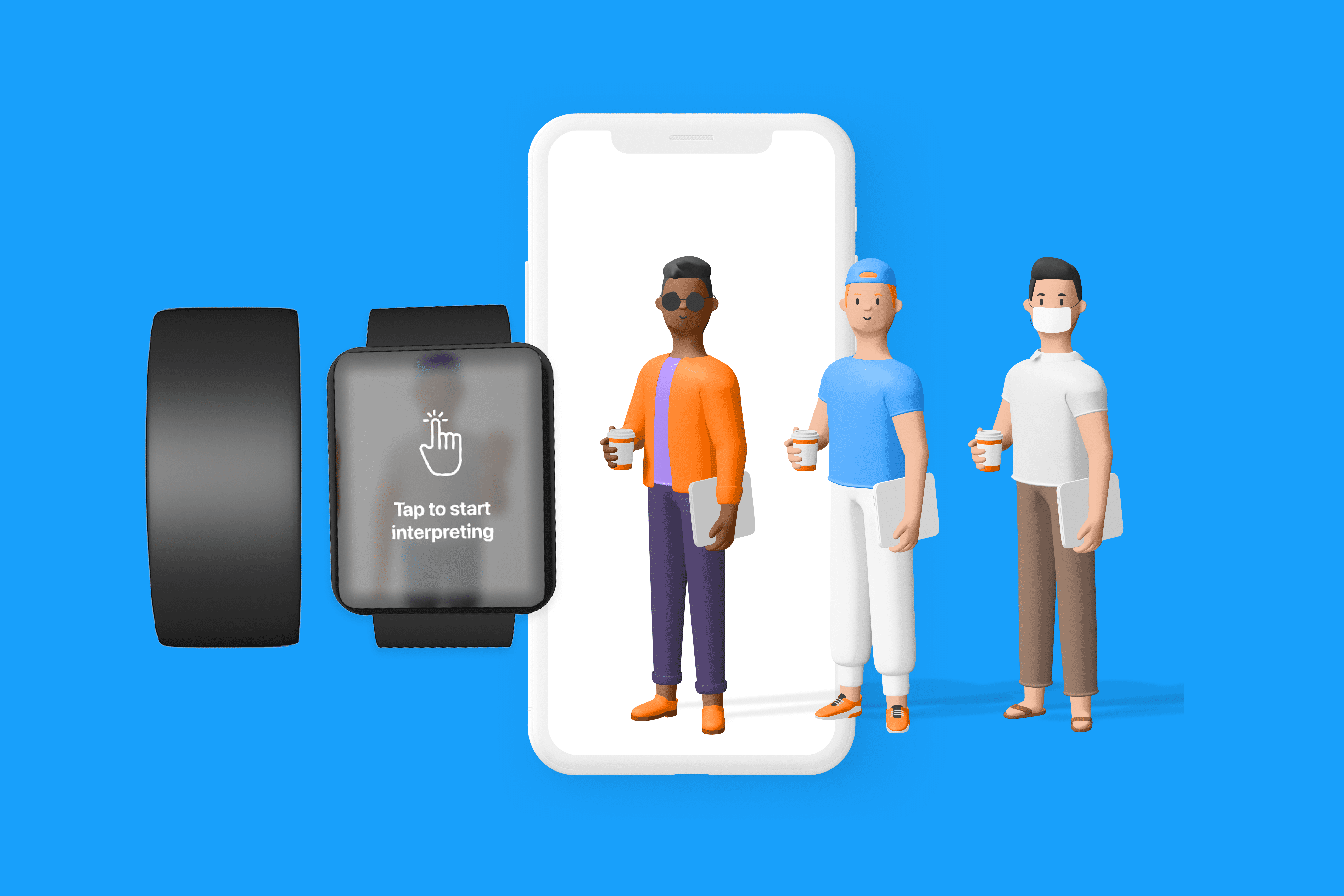
Keep all your travel documents in one place.

Discover & Explore
Understanding the problem space and our user's needs
We began by conducting market research to develop an insight into the current products being offered and the areas of opportunity we could fill.


Ideation
Developing & defining the User Experience
After the in-depth research, we began the visual and ideation process, while keeping our targeted audience in mind. We started by listing all the features we wanted to include and prioritize the list by using the MoSCoW method. Through this process, we were able to consolidate all our ideas into a system requirements chart to help us create the system map.


Design System
Bringing the experience together with a clear design system
As applying for visas can be stressful, we wanted to create a straightforward flow that would make the users feel at ease. We used calming colours and some illustrations for our brand. We chose a calming blue tone as our main colour to provide the value of security and professionalism. We used a standard san serif typeface followed the accessibility guidelines and used a font size that would be comfortable for our users.
We summarized the vision for our brand identity with 4 key terms:
clean


User testing & Iterations
Listening to our user's feedbacks and reiterating our prototypes
We conduct a few remote user-tests through zoom to gain insight and feedback. Through this, we were able to understand the users better and reiterate the errors in our flows and prototype.
Taking the insight we gained from the user tests, we implemented some changes that addressed each issue.


results
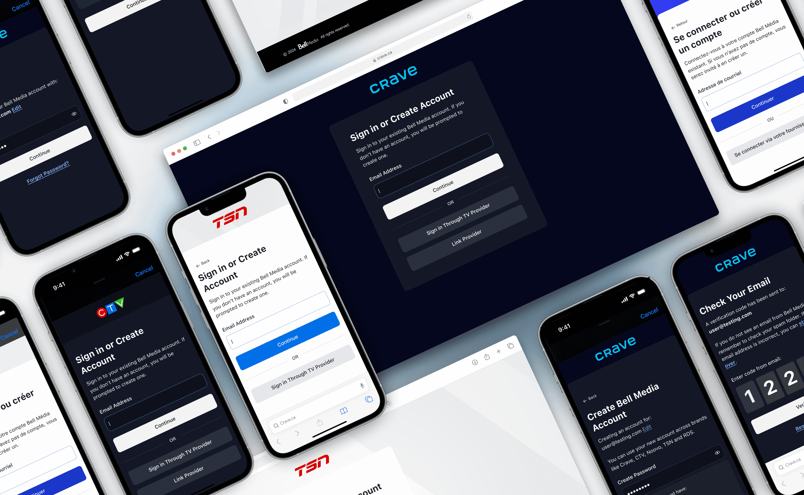
This project marked the beginning of a much larger shift.
This initiative didn’t just improve one flow, it helped lay the groundwork for Crave’s design system. It brought consistency to a range of user journeys and screens that had previously felt disconnected, The modular and scalable components introduced in this project became the starting point for broader cross-brand alignment.